A couple of weeks ago I attended the second day of Semi-Permanent at the Convention Centre in Darling Harbour. There was an array of speakers from the design industry, including controversial surf magazine ‘Stab’, collaborative soul searcher Aaron Rose, photographer/musician Max Doyle, R/GA digital agency, the enchanting Sandra Dieckman and VFX studio Moving Picture Company. All these speakers were very entertaining and each had helpful advice to offer an audience of budding designers.
However, the speakers I found most memorable were Rodney Eggleston and Anne-Laure Cavigneaux from March Studio, an architecture firm in Melbourne. Not only was the work they present innovative, sustainable, and awe-inspiring, but they manage to nail the brief given to them by Semi-permanent. They were asked to speak about their work in relation to the semi-permanency of design. The two responded by presenting temporary installations that the studio had nailed throughout the years.
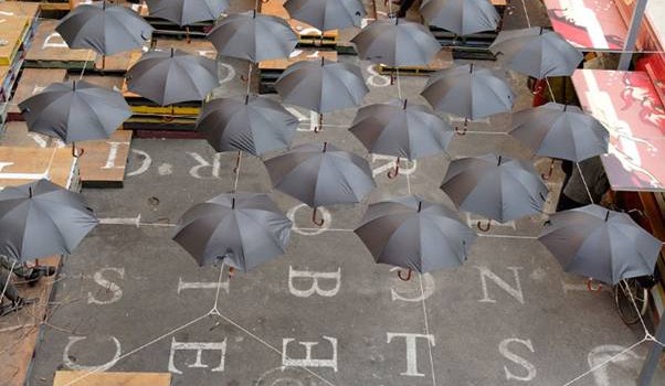
Perhaps one of the most ironic installations they create was section8, a pop up bar in Melbourne. This was designed from approximately one hundred umbrellas suspended on wire, surrounded by wooden crates and shipping containers. This installation was considered to be semi-permanent however it is still standing 6 years later. The brilliance of this design, is that many have been lead to believe it was spontaneous and not designed, however like many of March Studios projects, it was developed with a considerable amount of planning and problem solving.


March Studio’s work is characterised by a meticulous attention to detail, and often an innately creative, though very pragmatic approach to problem solving. They have created a plethora of engaging interiors using experimental and sustainable material which reinvigorate spaces in which they are contained.
One example is the Chinese house made of brown cardboard designed for the 2007 Australian Awesome Arts Festival in Perth. Children were encouraged to draw and paint pictures of their interpretation of Chinese life on the cardboard surfaces. This was completely semi-permanent and allowed for an open language about children’s perceptions of other cultures.


March studios abstract approach also has very commercial applications. One such example is their design for Baker D Chirico. With the full cooperation of the client they were granted creative freedom to create a functional yet a very memorable interior. The form of the space was inspired by the curves in loaves of bread and reflects the purpose of the bakery. When asking for shelf dimensions the client was unsure as all of his loaves where continuously changing. This pushed the project into an interesting direction where the shelves height and sizes vary to house a variety of bread shapes.


March studio presented a fresh perspective at Semi-permanent, as unique architects in a room of visual designers. They manage to inspire and engage the audience with the same relevance to design practice as other speaks, in some cases more so. Their methodical, innovative and sustainable approach to a design brief is what sets them apart and reflects the process of all creative practice in the design industry.
Here are some other examples of their work…


Semi-Permanent 2013


I loved how they always try to push a concept or idea as far as they can – often over several projects – getting the most out of their creative thinking. Beautiful work. Will be visiting some of these spaces on my next trip to Melbourne!
Very awesome, thanks for sharing this one!Love their work!
Aesop store designs are some of my absolute favourite!! Awesome to find out who is behind them.