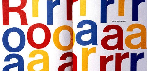
Also known as International Style, the Swiss Style does not simply describe a style of graphic design made in Switzerland. It became famous through the art of very talented Swiss graphic designers, but it emerged in Russia, Germany and Netherlands in the 1920’s. This style in art, architecture and culture became an ‘international’ style after 1950’s and it was produced by artists all around the globe. Despite that, people still refer to it as the Swiss Style or the Swiss Legacy.
This progressive, radical movement in graphic design is not concerned with the graphic design in Switzerland, but rather with the new style that had been proposed, attacked and defended in the 1920s in Switzerland. Keen attention to detail, precision, craft skills, system of education and technical training, a high standard of printing as well as a clear refined and inventive lettering and typoraphy laid out a foundation for a new movement that has been exported worldwide in 1960s to become an international style.
Emerging from the modernist and constructivist ideals, the Swiss Style can be defined as an authentic pursue for simplicity – the beauty in the underlines of a purpose, not beauty as a purpose in itself. The principle “form follows function” became a battle-cry of Modernist architects after the 1930s. As a consequence of this principle, most of the Swiss Style craft is devoted to the minimal elements of style such as typography and content layout rather than on textures and illustrations.
How the Swiss Style Relates to the Web
This style of graphic design was born in the institutional context. The majority of pieces from this movement are in the form of posters, stamps, institutional typographical identity, street signs, etc. In this sense, these artists are leveraging much more than just top-down communication, they’re creating user-friendly interfaces.
As a result of that, Swiss Style artists tend to put their artistic efforts in that the content they are conveying delivers its intended message in a clear, unobtrusive fashion. One can make the point that they were thinking, in a broader sense, about usability long before the web even existed. How can we not learn from these great masters?
Uniformity and geometry
Even a quick study of classic Swiss style works reveals a strong attention of graphic designers to uniform design elements and strong geometric shapes. Graphic artists have experimented with abstract geometric patterns, uncomon color combinations, text manipulations and striking abstract visuals that were used to clearly convey their purpose in a very remarkable way.
Follow this link to view the entire article on Smashing Magazine (oodles of great Swiss school examples here):
http://www.smashingmagazine.com/2009/07/17/lessons-from-swiss-style-graphic-design/


