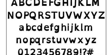
It’s good to see this custom font, designed to reduce the effects of dyslexia, is now making headway after being open-sourced.
http://www.bbc.com/news/technology-19734341
The OpenDyslexic font is designed to give “gravity” to letters to prevent the characters rotating in readers’ minds
A free-to-use font designed to help people with dyslexia read online content is gaining favour.
OpenDyslexic’s characters have been given “heavy-weighted bottoms” to prevent them from flipping and swapping around in the minds of their readers.
A recent update to the popular app Instapaper has adopted the text format as an option for its users.
The font has also been built into a word processor, an ebook reader and has been installed on school computers.
The project was created by Abelardo Gonzalez, a New Hampshire-based mobile app designer, who released his designs onto the web at the end of last year.
“I had seen similar fonts, but at the time they were completely unaffordable and so impractical as far as costs go,” he told the BBC.
“I figured there’s other people who would like the same thing but had the same issues, and so I thought I’d make an open source one that everyone could contribute to and help out with.
“The response has been great: I’ve had people emailing saying this is the first time they could read text without it looking wiggly or has helped other symptoms of dyslexia.”
The 28-year-old released OpenWeb – a free web browser based on the font – on Apple’s iOS app store earlier this year.
He then used online adverts to publicise his invention on a series of related sites.
Several developers who heard about the innovation subsequently jumped on board, including the creator of Dox on Box, an e-reader for iPads; and the makers of Wordsmith, a stylised word processor for Mac computers.
Users have also installed the font onto Android devices, allowing it to be used across a range of software, and the jailbreak community has also enabled adapted iOS devices to install it to permit similar functionality on Apple’s mobile devices .
However, the inclusion of the font in Instapaper last week is perhaps the clearest sign yet that it is going mainstream.
The program – which allows users to save versions of webpages so that they can be read offline – has about two million registered accounts.
The app’s developer Marco Arment said he had first looked for a dyslexia-optimised font two years ago, but had failed to find one until he discovered OpenDyslexic.
“Given what Instapaper does – capture any web page and present it in a consistent, adjustable, customer-controlled environment – it’s a natural fit for bringing improved accessibility and legibility to anyone who needs it,”he wrote on his blog.
Enhanced e-readers
Mr Gonzalez said he had also been contacted by The Kildonan School – which specialises in teaching children with dyslexia – to tell him it had started testing the font with its pupils.
He added that he had also heard from other teachers in the US and UK who were using the product in a less formal capacity.
Although he is happy to see the font spread organically, Mr Gonzalez said he was also trying to encourage some of the major tech firms to support it.
“Sony and Amazon have said they would consider it for their e-readers,” he said.
“Google is also hopefully going to publish a version to its web fonts directory which would make it really easy to integrate it onto websites without administrators having to upload it to their servers.”
According to the British Dyslexia Association (BDA), about 4% of the UK’s population has a severe form of the disability. The campaign group welcomed the innovation’s spread.
“As a dyslexic, I find this font very easy to read and reduces the effects of visual stress that I experience,” said Arran Smith, the group’s project officer.
“I especially like the spacing between letters, as it is even and regular, which is also recommended within the BDA Style Guide.”


