52 weeks of UX – a discourse on the process of designing for real people
Looking into ways to educate others about User Centred Design, without wanting to develop a Uni course, I came across 52weeksofux.com featuring Joshua Brewer and Joshua Porter. I like the way these two senior UX Directors have described different aspects and views on UX and recorded their posts over the course of 1 year, or 52 weeks. Because it is quite a big read, but very valuable nonetheless, I will summarise their posts in 5-week-parts.
This is a summary of Week 6-10
Week 6
Porter talks about the usage lifecycle: the series of steps that users proceed through when interacting with a product or service. People act very differently in each stage of the lifecycle. In ‘first contact’, people’s perceptions are formed. ‘First time use’ is the most critical moment in the lifecycle as it is when a user considers a long-term engagement. ‘Ongoing use’ is regular use of a product or service. ‘Passionate use’ is the ultimate goal, and rarely attained. It is when the user gets into a state in which they are highly productive/immersed and share the passion with others. It is how organic growth happens. ‘Death’ is when people stop using your product/service. This can happen at any time during the lifecycle.
Each stage has different design challenges. So know your user, and also know what they are doing in each specific lifecycle.
Brewer writes about ‘You are Not Your User’. As a UX designers the actions, decisions and preferences you have taken through the entire life-cycle of the product, have been imprinted into every aspect of it. First time users will have formed their own expectations – and it most likely won’t match the designer’s subjective preferences.
It is essential to uncover the (flaws in the) users assumptions through user research, ie interviews, contextual inquiry, surveys, card sorting and usability testing. It takes time to understand a user. Take this time for the opportunity to turn a user into the greatest advocate of your product.
Week 7
Liz Danzico (chair at MFA Interaction Design Program at the School of Visual Arts), guest author, writes about ‘Makers of Frames’. Tying in with what Joshua Porter says: “The behaviour you’re seeing is the behaviour you’ve designed for”, Liz states that as designer we frame opportunities intentionally, leaving room for new stories to be told, leaving room for behaviour to unfold both true to the vision of the creator and in the imagination of consumer—the story that unfolds is a shared one.
She also describes some principles from Erving Goffman, the father of frame analysis
– “People are unlikely to be aware of the framework.”
– “People tolerate the unexplained, but not the inexplicable.”
Joshua Porter continues on the “The power of frameworks”, describing the different kind of frameworks, with which UX designers deal often at the same time:
– Structural Frameworks: Affect the way we move through space. Offline known as architecture. Online known as interaction design/information architecture. Well-designed pages (and rooms) serve a specific purpose.
– Visual Frameworks: Affect the way we see things. Are elements appropriated weighted so that their relationships are clear?
– Social Frameworks: Affect the way we interact with others. Are you able to import or export your relationships, and (more importantly) does it make sense to do so? We have only begun to investigate social frameworks.
– Conceptual Frameworks: Affect the way we think about something. Are they “sharing the love” or “creating buzz”? The words and images we use shape the way people think about what we build, and, in the long run become our brand.
Week 8
Joshua Brewer lists the ‘good design is….’ by Dieter Rams:
– Good design is innovative.
– Good design makes a product useful.
– Good design is aesthetic.
– Good design makes a product understandable.
– Good design is unobtrusive.
– Good design is honest.
– Good design is long-lasting.
– Good design is thorough down to the last detail.
– Good design is environmentally friendly.
– Good design is as little design as possible.
Porter talks about how we don’t have as much time to learn something new, as we used to. We learn how to fly, while already flying. Embedded support is taking over from help manuals. So for software, it is crucial to have help built into the user interface, in context. The interface thus becomes more integral to the user experience, instead of simply being a tool to do a task with. Julie Larson-Green said: “User interface is customer service for the computer.”
Week 9
Brewer quotes Kathy Sierra on the topic of ‘make less more’: “What if instead of adding new features, a company concentrated on making the service or product much easier to use? ….”
Porter quotes Herbert Simon from The Sciences of the Artificial, 1962 on ‘changing existing situations’: “The intellectual activity that produces material artifacts is no different fundamentally from the one that prescribes remedies for a sick patient ….”
Week 10
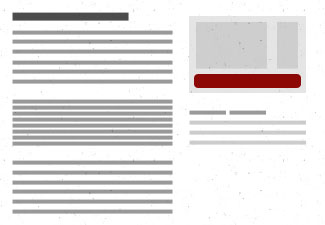
Porter writes about one of the most important principles in all of user experience: Visual Hierarchy. It suggests that hierarchically is the proper way to view content visually.
A thoughtful designer will efficiently move the viewer from one piece of content to the next. You use hierarchy to tell a story, to provide context that culminates in the action being taken, confidently. Weak hierarchies, don’t set appropriate context and fail to organize information in a helpful way and leave users without a clear idea of what to do or read next.
Brewer talks about Visual Weight, used to reinforce Visual Hierarchy by contrasting the size, colour and/or position of elements in the design. Each decision you make on this as a designer has a measurable impact on the overall flow and coherence of the page. Something as seemingly insignificant as line-height can have a dramatic impact on how the user understands the screen they are looking at. Colour is another key in establishing Visual Weight and is often utilized to draw attention to actions that can be taken on the screen. Take the well-established practice of using the colour blue for links; when scanning a page, the use of blue links within the sea of grey text becomes an clear signal for action.


")


