Web developers are always having to walk the tight line between creating beautiful, modern sites, and complying with client demands that everything needs to look exactly the same on all browsers, including IE 7 (if you’re job requires you to be nice to IE 6 as well, god help you, because this article won’t).
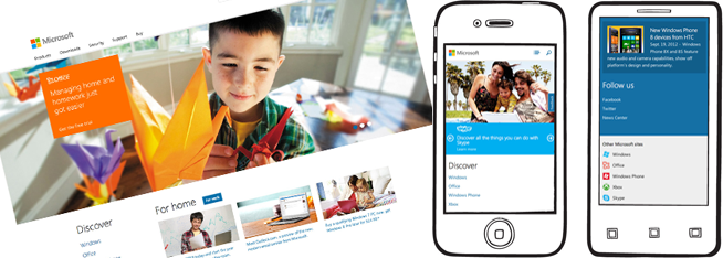
With the prevalence of smart phones – almost 20% of people accessed retailer’s sites on a phone last Christmas, it’s becoming more and more important to ensure users can access your site from any device that has internet access.
Discounting Facebook, most punters are agreeing a responsive site – one that serves the same content to all devices, but just restyles it to fit properly – is the way forward.
With the astronomical growth of the mobile market, web boffins are suggesting that we should actually design sites with mobile devices in mind first, and then work upword, making it fit on large resolution devices.
While these are great ideas, suggesting it to a client or Dilbert style boss may make a few heads explode. But with Microsoft’s recent redesign (which even the haters aren’t hating so much), we might just have the leverage we need.
The idea is to design a site with a basic linear layout that works on mobile devices, and then conditionally add in the CSS required for it to work on an iPads, notebooks and PCsetc using media queries.
Media queries aren’t new – the idea first popped up in 2001, and you’ve probably been using media=”screen” in CSS link tags for moons, but now with over 80% support (by browser usage), it’s well past time to start taking advantage of their full potential.
If you’ve been clicking the link bait above so far, you should have a fair bit of info on how to go about creating your mobile-first media query powered site (if you haven’t, do you even know how to internet?), so I’m going to focus on handling that last 20% or so of users that have browsers that don’t support media queries.
The beauty of going mobile first is that older, crapper mobile devices that can’t handle this breed of modern CSS (and will be too hard to debug, and not do well with JavaScript polyfills), will see exactly what they’re meant to anyway, becuase it’s the CSS meant for bigger screens that they’re not getting.
This leaves IE 7 & 8, as always, and very old versions of FF and Opera. The best thing to do, is include Respond.js, which tests if media queries are working, and if not, parses the CSS and applies the relevant blocks depending on the screen resolution, even as the browser is resized or rotated – pretty smart.
And if you’re worried about users without JavaScript, try respond.php, which is slightly less flexible (as it’s doing all the work on the server side). It lets you pick a resolution to match media queries, so given that this would only be for non-mobile devices, maybe 960px? This would make the site look like it was on a 960px screen, regardless of the resolution it’s on. This might seem too presumptuous, but a user with a browser this old, and no JavaScript, would be 1 in a million. Or at least we can hope. Why not bigger than 960? Well 1024×768 screens are still pretty popular, and the stats would be skewed well up for the older browsers we’re targeting with this fix.
And that’s it! You should be able to cover very close to 100% of users now, go forth and respond!


")


