Following the recent release of Debra Levin Gelman ‘s book, Design for Kids as well as some exciting new apps highlighted in the Experience for Children category of the recent design for experience awards, there has been increasing discussion on how to create the best user experience for digital natives.
A digital native is an individual with a greater level of comfort with technology, as they were born after the general introduction of digital technologies and have been interacting with tech devices from an early age.
Today’s children have grown up with technology and are more comfortable users than previous generations. Depending on the frequency of exposure to computers, ipad and mobile devices, kids can become quite experienced users at an early age. Because their brains are still developing, exposure to technology during childhood can wire the brain in very different ways. For example, technology writer Nicholas Carr explains that while reading encouraged our brains to be focused and imaginative, the internet is strengthening our ability to scan information rapidly and efficiently.
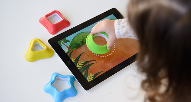
Designers need to keep in mind the elements that make an engaging experience for young users, as well as the differences between the age groups of their audiences. Designers also need to balance between digital and physical worlds, and think about how to bring these two worlds together.
Here are 5 usability guidelines to remember when designing for kids:
1. Using metaphors from the physical world.
Make a familiar environment for the target age group by using elements that children will recognise and are used to. “Children want to interact with technology in the same way they have interacted with toys and nature in the past,” says Joshua Davidson, Managing Director of Night Zookeeper. He explains that children want to hold ergonomic devices and see the effects of what they’re doing on the screen. The Night Zookeeper application handles these interactions in a uniquely engaging way, for sample by having children ‘roar’ to unlock the application.
2. Stay focused on the target audience.
Every age bracket has different requirements from navigation, content and interactivity. As children gain experience and exposure to technology their needs as users change dramatically. For example, if designing for a child 6-8 years of age, we need to consider that they will ignore a good deal of the text, but an older child of 9-12 will start to exhibit the text scanning behaviours of adults. The changes can be very noticeable even within just one grade difference between the children. These findings were a result of a study by Jakob Nielsen they found that children were so aware of these differences that some would not use an app if they believed it was for younger kids, saying things like “this app is for babies”.
Both Jakob Neilsen and Debra Gelman recommend use of colour, large fonts, and large clickable areas (including navigation) for an app targeted at children. Use images rather than text, and where text needs to be used, font size should be large – font size can start to decrease as you’re working with older age-groups. Animation and sounds attract and keep the attention of young users (even though we steer away from this as adult users).
3. Observation and testing
It is imperative to understanding the range of abilities and experience of children as there is such a broad difference between age groups. Design for Experience Awards Finalist Busuu incorporated testing throughout the entire project cycle, as they placed highest importance on observing children from different age groups and backgrounds. They were able to learn how the children interact with mobile devices, their reactions to content and characters.
4. Dont forget: Parents are your users too
There have been differing opinions on whether to include a parents’ section in applications for older children. As kids get more tech savvy, they need less assistance from parents. For younger audiences, suggested approaches include keeping the parents area separate by requiring a long press, requiring two taps in separate areas of the screen, or requiring some other deliberate action in order to bring up parental controls. If offering in-app paid services, parental controls most definitely need to be included.
5. Gamification
Kids like to do things and learn via play, and gamifying the application is a great way to motivate children to come back and discover new things. Busuu‘s new application gamifies the process of learning new languages by presenting kids with a garden world, where they can move around their plot and discover new plants and water their garden by completing lessons.
Watch this space – this is such a rapidly changing topic area:
– The number of apps focused towards younger users increases.
– App developers continue to innovate and compete in this space.
– Government and educational bodies are discussing how to improve technical subjects delivered to increasingly tech savvy generations.
– Advances in technology help us bridge the gap between the physical and digital world.
The next generations have a lot to look forward to!
Check out Deepend’s work on enhancing the experience for kids using the Nickelodeon website here
If you want to read more about how needs change between levels of experience with technology and on the differences between age groups:
http://www.nngroup.com/articles/childrens-websites-usability-issues/
http://uxmag.com/articles/giving-kids-digital-experiences-they-can-really-use
http://www.lukew.com/ff/entry.asp?1179
http://awards.designforexperience.com/categories/2013/experience-for-children


