Since travel websites (and travelling in general) are very much search orientated, the search tools used on a site can heavily impact results (obviously). But it can also significantly affect the ease of the user’s path-to-purchase, the number of returning visitors and the overall user-friendliness of the site.
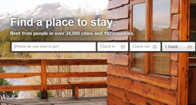
One of my favourite travel websites is Airbnb. Yes it looks gorgeous with bright, enticing images of destinations and state-of-the-art interior design and architecture, but the search engine is also intuitive, clean, and personal. “Where do you want to go?” it asks, a simple and exciting prompt, because after all, the process of booking your holiday can be half the fun.
The homepage features include auto-complete (very important), simple check-in/check-out dates with drop-down calendar and an option to select the number of guests. Too easy! It makes the first part of the search quick and nonthreatening, anyone can manage it which is important with a site where the concept of staying in a strangers house while on holiday may not be familiar.
Then there’s the second stage of the search once you have arrived at your list of rental options. Once here you can easily spot the search filters that surround your results, which help you specify room type, price, neighborhood, amenities, keywords and view your property on an interactive map. You can choose to see the rentals by list, photo or map and also have the option to edit your search at any time. You can add rentals to your wish list for later reference (or simply collect a list of places you will never be able to afford and goggle at them like myself) and can edit your filters at any time before your search results update quickly on the same page to avoid disorientation.
This is one stand-out example of a travel website search tool. Econsultancy have also put together a list of example travel site search tools and have included a list of key features included in any good search tool for potential travelers. See the list below:
Features of good travel search tools
- Auto-complete. This helps to avoid misspellings and eases the workload for the user. So, if you want to go to Ust Kamenogrosk in Kazakhstan, auto-complete saves a lot of time.
- Flexible date settings. Sometimes searchers don’t have fixed dates in mind, so allowing them to search a few days either side of the selected dates helps. This could be something provided via the form, or on search results pages.
- Usable calendar tools. Make it easy for customers to select departure and return dates. Little things like ensuring that customer cannot select incorrect dates (i.e. return dates before departure) will avoid hassle for users.
- Placement of search box. This is perhaps the most important feature on a travel site, so sites want to direct users to this straight away. Some sites have only a search box on the homepage while others devote more space to offers and promotions.
- Plenty of search options. There is a limit, but the more options users have before they search, the more accurate the results should be.
- Mobile friendly forms. Travel searches and bookings on mobile are on the rise, so make sure mobile users can access forms and use those pesky calendar tools.
You can look at their list of examples on their blog: http://econsultancy.com/au/blog/63123-25-examples-of-search-tools-from-travel-websites?dm_i=LQI%2C1Q6ZD%2C9O5KD9%2C658TJ%2C1&utm_campaign=2901721_808-daily-pulse-uk-2013-07-25&utm_medium=email&utm_source=Econsultancy


