It’s good to be Joe Gebbia these days: A mere five years ago, his friend from RISD, Brian Chesky, arrived on his doorstep to rent a room in his loft. That same weekend, a flood of fellow designers were rushing to find hotels for an upcoming design conference. There weren’t any hotels left. Chesky didn’t have a job. So the two of them decided to put a handful of their itinerant peers up for the weekend, and made a quick $1,000. Airbnb was born. Today, the company is valued at around $2 billion, and it’s rumored be raising another $100 million in venture capital, in addition to the $120 million it has already gathered. It’s still seeing hockey-stick growth, and they’re rapidly expanding overseas. But anything that grows so fast can disappear almost as quickly–and that’s precisely why Airbnb has been aggressive in transforming their site into a social experience rather than a search portal. Gebbia, who was recently a judge in our Innovation By Design Awards, recently stopped by Fast Company to chat about how that transformation first occurred.
FROM A STAR TO A HEART
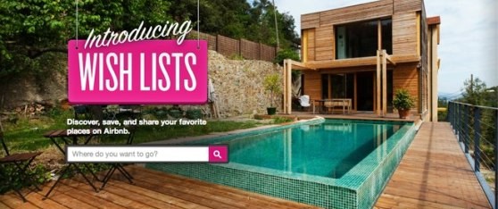
That effort began with a total site redesign just four months ago, centering around “Wish Lists,” which are lists of lust-worthy properties that users create themselves. Today, 45% of their users engage with Wish Lists, and over a million have been created. Perhaps none of it would have happened if they hadn’t seen just how radically a few simple changes can remake people’s relationship to the site.
For a couple years, registered Airbnb users have been able to star the properties they browse, and save them to a list. But Gebbia’s team wondered whether just a few tweaks here and there could change engagement, so they changed that star to a heart. To their surprise, engagement went up by a whopping 30%. The star, they realized, was a generic web shorthand and a utilitarian symbol that didn’t carry much weight. The heart, by contrast, was aspirational. “It showed us the potential for something bigger,” Gebbia tells Co.Design. And in particular, it made them think about the subtle limitations of having a search-based service. “You have to have search,” Gebbia says. “But what if you don’t know where you want to go?”
Probing the reasons why a heart was so different from a star, they eventually landed on the concept of Wish Lists. Outwardly, these are similar to a pinboard you might set up on Pinterest–it’s just a list of places you really, really want to visit that’s designed to be shared. You can broadcast your Wish List additions on Facebook; you can see the Wish Lists friends have created; you can share the Wish Lists with others, for trips you’re planning. But the bigger picture is that Airbnb’s listings become content. And as content, the Wish Lists offer a way to unlock listings that would otherwise float in the ether, undiscovered.
Partly, this is a functional improvement: You can use these lists to plan trips collaboratively. But the Wish Lists also serve to change users’ relationship with the site. Instead of visiting just to book rooms, they might visit simply for fun. Long term, that’s where Airbnb’s brand equity will come from. It’s what could keep the site top-of-mind in that instant when a potential customer begins planning a trip but just before they’ve started searching hotel listings online. It’s a lesson that other companies pondering the move away from search and toward social discovery, would do well to emulate.
THE CODING MAGIC THAT MAKES IT WORK
Hundreds of millions in venture capital buys you a lot of nice things, including 10 offices worldwide and the ability to send a photographer to shoot a location just 48 hours after its owner has registered it on the site. It also buys you an ability to pay close attention to tiny little details of engineering that the casual user might never notice. The most jaw-dropping of these–at least to coders–would probably be the infinite scroll you see on a page of Airbnb listings. Go ahead and try it (but don’t just scroll directly to the bottom of the site). It’s rock solid. You can scroll and scroll and scroll without the page ever seeming to slow down; you can scroll back up and there’s no hitches at all. (Coders: Airbnb actually open-sourced this bit of magic at infinity.js, as a gesture of goodwill to the coding community.) The magic lies in the fact that the scrolling is so effortless even though the images are so big; if you want to see what the typical alternative is, I hate to say it, you can try out the infinite scroll on Co.Design’s homepage.

This might seem like a minor detail, but as any good engineer will tell you, speed equals engagement. By keeping people scrolling down the page, by seamlessly tickling their urge to find another gem, that simple bit of scrolling code reaps untold gains in customer gratification. And that’s important because the site, if it really is to be a socially driven magnet powered by content, will need to prove that the content is great, with every single visit. One way to do that is to get people to literally see more listings, effortlessly.
By Cliff Kuang
Via http://www.fastcodesign.com/1670890/how-airbnb-evolved-to-focus-on-social-rather-than-searches#1


Another amazing find Dani – love it! Fascinating insight re star vs heart buttons.
Heart = something YOU love, & says something about YOU.
Star = utilitarian, adding to a list of places to go on holiday you’re planning now.
<3 ;P
Thanks em <3
Definitely One of my favourite sites !