Editor’s note: Avi Charkham is Head of Product & Design @ lool ventures, an early stage, value-add venture capital firm based in Israel and the incubators of MyPermissions personal cloud security service.
Do you know how many apps access your personal information on Facebook? Check your Facebook apps permissions and get ready for a surprise.
In fact, Facebook keeps “improving” their design so that more of us will add apps on Facebook without realizing we’re granting those apps (and their creators) access to our personal information. After all, this access to our information and identity is the currency Facebook is trading in and what is driving its stock up or down.
It should be no surprise that in the new App Center Facebook made another leap forward in their efforts to get you to expose your personal info without realizing you’re doing so.

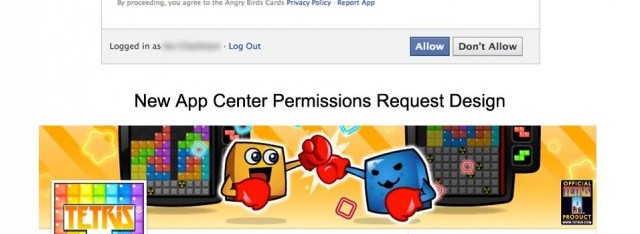
#1: The Single Button Trick
In the old design Facebook used two buttons – “Allow” and “Don’t Allow” – which automatically led you to make a decision. In the new App Center Facebook chose to use a single button. No confirmation, no decisions to make. One click and, boom, your done! Your information was passed on to the app developers and you never even notice it.

#2: The Tiny Gray Font Trick
Facebook designers know that you are used to ignoring those gray texts on the page. You’re practically conditioned to think that gray text = unimportant. This is why they chose gray for the permissions you’re about to grant.

#3: The Tiny Hidden Info Symbol Trick
In the old Design Facebook presented a detailed explanation about the “basic” information you’re about to expose to the apps you’re adding. In the new design they decided to hide that info. If you pay careful attention you’ll see a tiny little “?” symbol and if you hover over it you’ll discover that this app is about to gain access to your name, profile pic, Facebook user ID, gender, networks, list of friends and any piece of info you’ve made public on Facebook. Quite a lot of info for a 20×10 pixel tiny hidden info symbol don’t you think?!

#4: The Action Line Trick
The designers at facebook know that your eyes will automatically focus on the main action button and will ignore anything below this virtual action line. This is why, in the new App Center design, they hid the detailed permissions you’re about to grant below the action line.

#5: The Friendly Talk Trick
In the new App Center Facebook chose to hide the term “Permissions”. Instead of showing “Request for Permissions” and a button labeled “Allow” Facebook now sends you to a page full of colorful images with a single button labeled “Play Game”.

http://techcrunch.com/2012/08/25/5-design-tricks-facebook-uses-to-affect-your-privacy-decisions/


")


