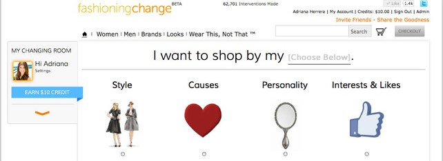
Autistic children with limited verbal skills are often taught how to communicate and make choices using pictures. Drawing on her experience as a behavioral therapist in college, Adriana Herrera realized that key design principles from her work with Autistic children could also be applied to the website she founded, Fashioning Change.
So last week, –which suggests ethically sound alternatives to a visitor’s favorite brands–ditched its old user interface and adopted one based on a tool for teaching autistic children called the Picture Exchange Communication System (PECS).
“Having a disability is just a different way of viewing the world,” Herrera toldFast Company. “Sometimes that means it’s a non-verbal way of communicating. That’s what the web is, though–a non-verbal way of communicating.”
She may be on to something. An earlier beta version of the site offered a ‘wear this, not that’ format pitting brand favorites directly against similarly designed products with better impact profiles. Since launching the new UI, engagement–as measured by return visits and browsing–is up 120%. It can be hard to tell what’s behind an uptick like this when a website is still so new that it hasn’t established a baseline, but Herrera attributes it to the redesign.
Autistic students using PECS are taught to exchange single pictures for the items or activities they represent. Later on, they’re taught to combine pictures to form requests or comments. In many cases, a board or book with detachable images is used to complete simple concepts such as “I want” or “afternoon schedule.” Fashioning Change’s website now looks much like one of these boards. Before new users start shopping, they are asked to select image icons in response to a series of simple questions such as ‘I normally wear?’ and ‘I would like to shop for?’ It works not unlike a PECS board. While it’s not always beautiful, the interface is easy to use.

“Our goals are very similar to the goals of PECS: guide nonverbal communication, facilitate choice, and help people adopt behaviors that make their life better,” wrote Herrera in a blog post that explains the changes. When they’ve finished the survey about their style, cause preferences and personality their search takes the same format. They can choose photo icons that represent each filter in order to finish the sentence ‘I want to shop by my…’
PECS isn’t the only way autism therapy helped inspire Fashioning Change’s new structure. Herrera says that just about every part of the site is based on some psychological principal. Users are bound to run into, for instance, constant reminders that the startup’s merchandise is ethical. When they scroll over an item, pop-up text might remind them that it’s made out of recycled material. When they place it in their shopping carts, they may see that the company doesn’t use sweatshop labor.
Frequent positive reinforcement is a concept Herrera borrowed from another treatment style called ABA Discrete Trial Teaching in which patients are given positive reinforcement for completing small steps that work toward their goal (in this case, making a purchase).
http://www.fastcodesign.com/1670363/how-a-ui-for-autistics-led-to-better-online-shopping


